B2B E-Commerce Website : Heuristic Evaluation & Redesign
Mobile App
Company
Jewelry & Diamonds Company
My Role
UX Designer
Tools
Figma Miro Notion Google Analytics
Timeline
2023 – 2024
Challenge
To improve usability and website performance by identifying UX pain points and redesigning within the budget and time constrains, and develop a strong product
impact
Jewelry retailers today must balance the needs of both B2B and B2B2C customers online. In a two-month contract as a UX Designer for a leading NYC jewelry brand, I conducted a heuristic evaluation and web analytics review to uncover key usability issues.
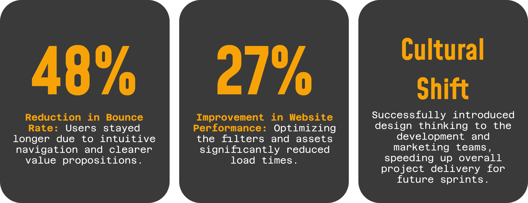
By addressing over 20 design flaws, we achieved
27% improvement in website performance
48% reduction in bounce rate.
Introduction of design thinking workshops and, embedding user-centered practices into agile workflows helped speeding up project delivery.

Challenge
The Problem:
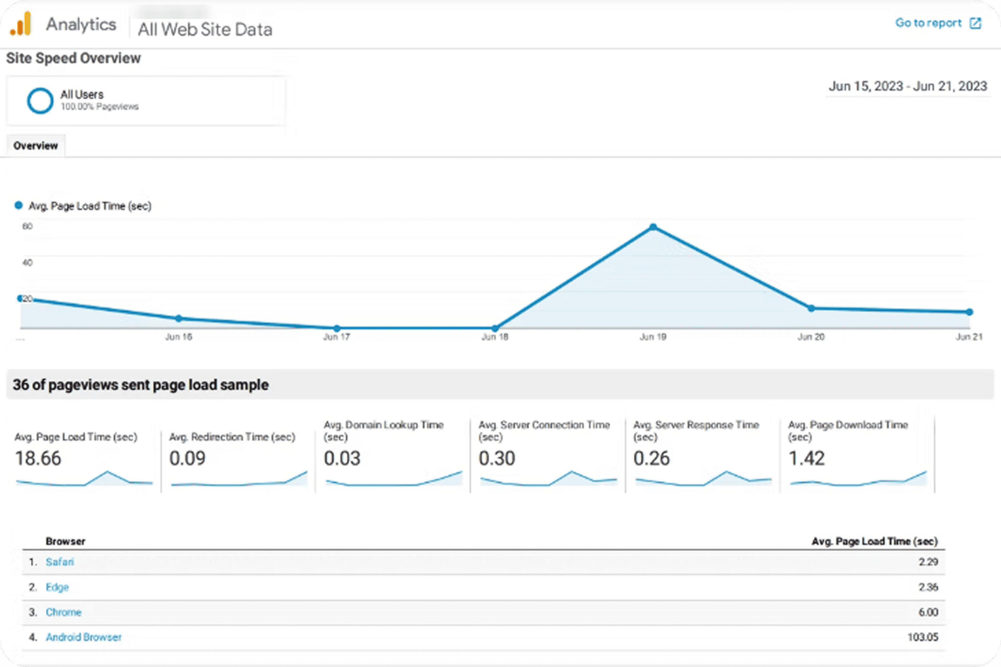
The client’s existing online store was suffering from high bounce rates and sluggish performance. Users were experiencing information overload, unexpected navigation paths, and slow load times caused by excessive filtering options.
The Goal:
The primary objective was to improve usability and website performance by identifying UX pain points and redesigning core pages to balance the complex needs of both B2B and B2C users.
Process
To ensure data-driven decisions, I employed a mixed-methods research approach followed by collaborative design iterations.

Phase 1: Comprehensive UX Audit
Heuristic Evaluation: I conducted a rigorous audit of the current site, documenting deficiencies and assigning severity scores to prioritize fixes.
Web Analytics Review: Leveraged Google Analytics to visualize drop-off points and understand behavior patterns.
Competitive Analysis: Benchmarked against industry leaders to identify standard practices for jewelry e-commerce.
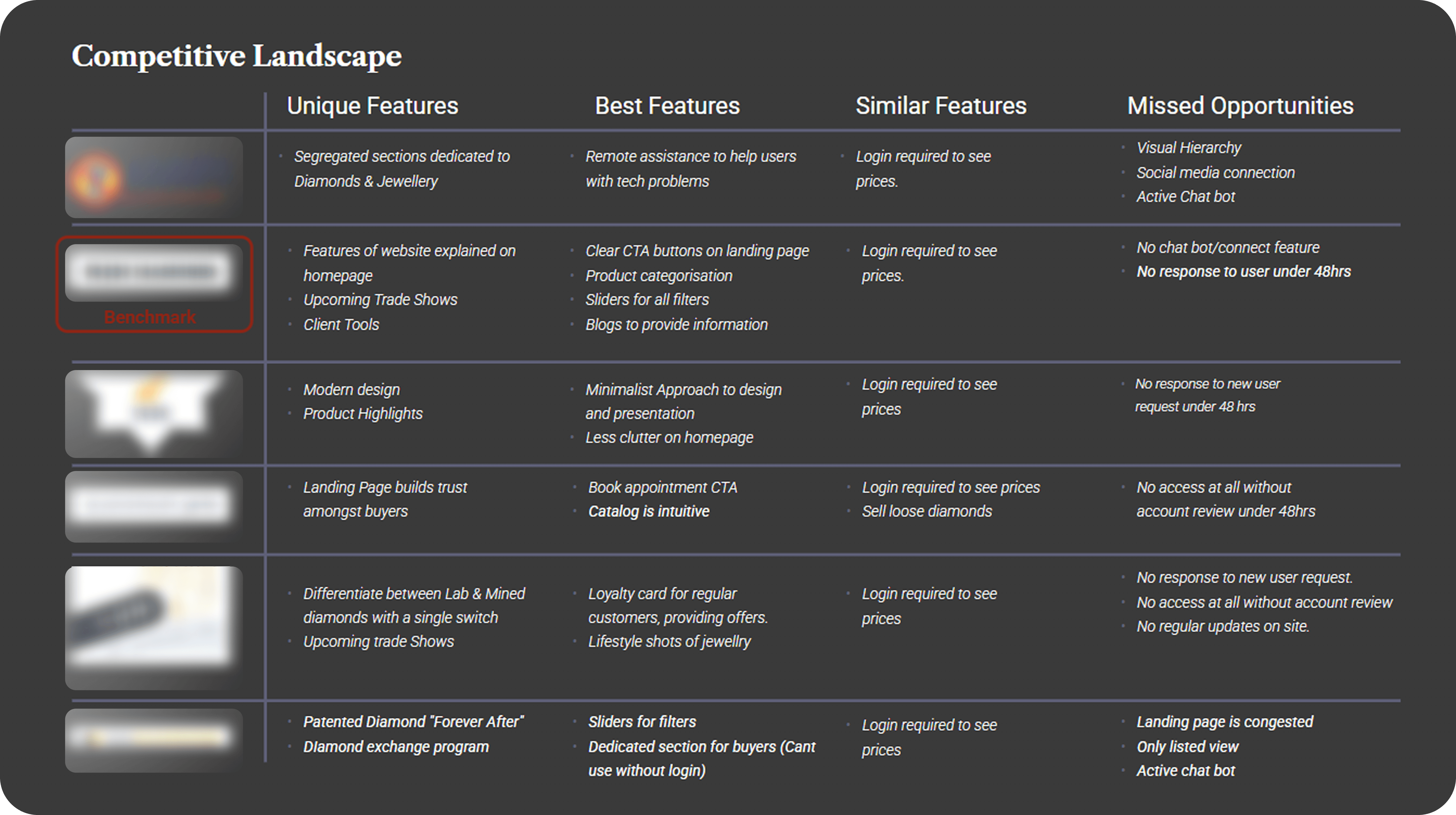
Phase 2: Defining the Friction (Findings)
The audit uncovered over 20 design flaws, categorized by severity:
Severity 3 (Critical): Excessive filters causing slow load times; confusing navigation paths leading to dead ends.
Severity 2 (Efficiency): Redundant clicks required to complete simple tasks; inconsistent layout elements.
Severity 1 (Aesthetic): Cluttered interfaces and non-intuitive iconography that broke minimalist design principles.
Phase 3: Collaboration & Design
Stakeholder Alignment: Presented a detailed audit report to the Business Owner, Marketing Lead, and Developers to align usability fixes with business goals.
Design Thinking Workshops: Facilitated sessions to shift the team mindset toward user-centered practices, integrating these steps into their existing agile workflows.
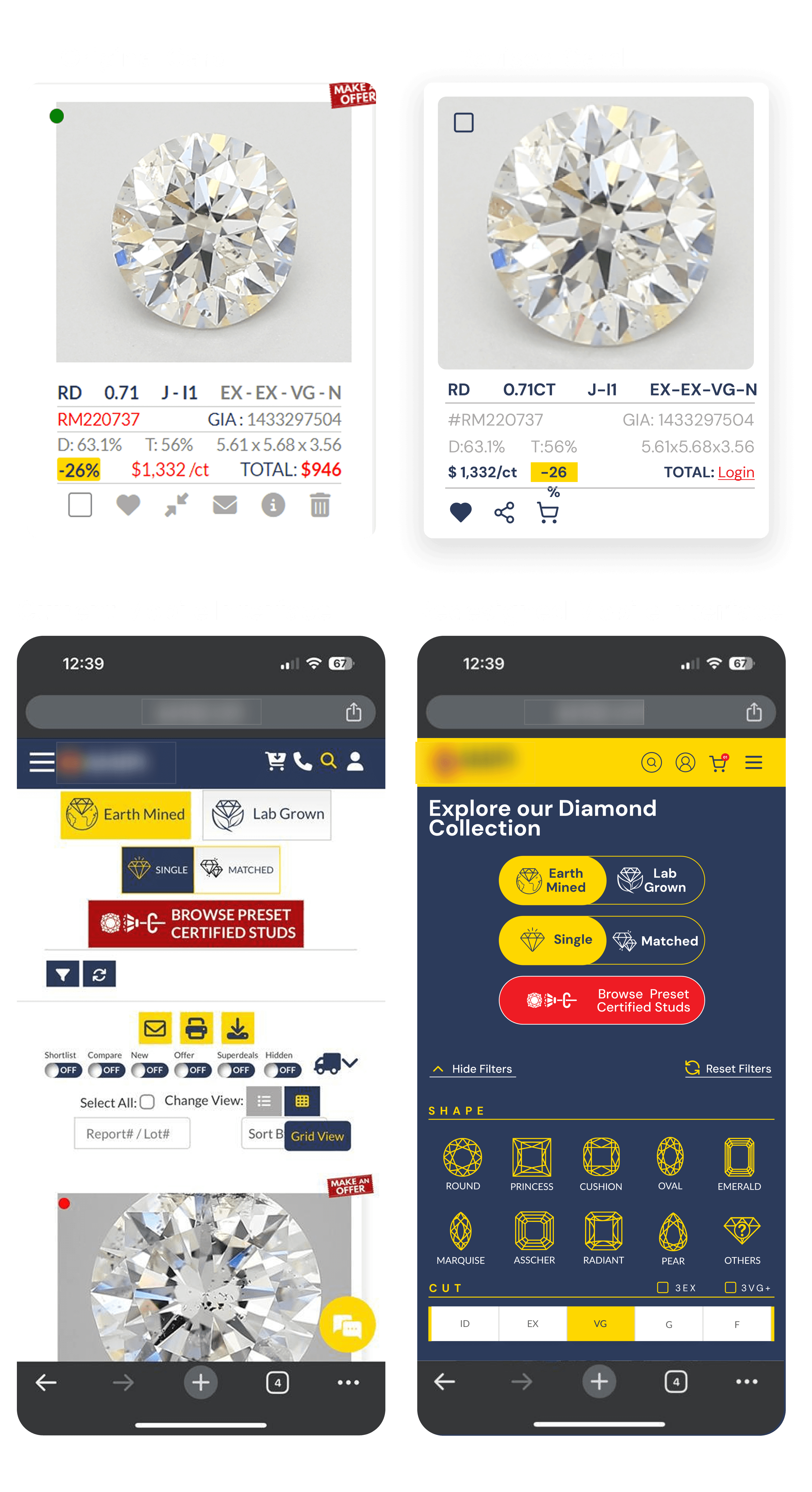
Iterative Redesign: Architected a revamped landing page and optimized UI elements to reduce cognitive load.
Solution
Based on the audit findings, the redesign focused on simplification and speed:
Streamlined Navigation: Restructured the information architecture to prevent "unexpected navigation paths," ensuring users could find products in fewer clicks.
Optimized Filtering System: Redesigned the filter logic to reduce server load and improve page speed, directly addressing the "excessive filters" issue.
Visual De-cluttering: adopted a minimalist aesthetic, removing non-intuitive icons and unifying layout standards to fix the "inconsistent interface elements."


The Impact
The redesign delivered measurable improvements in both technical performance and user engagement:
Takeaway & Reflection
Data Wins Arguments: Presenting stakeholders with a severity-scored audit and Google Analytics data removed subjectivity, allowing us to prioritize critical fixes quickly.
B2B/B2C Balance: Designing for dual audiences requires flexible interfaces that allow quick bulk actions for B2B while maintaining the storytelling aspect for B2C.
Agile Integration: Facilitating design workshops proved that UX isn't a bottleneck but an accelerator for agile workflows.
The Heuristic Analysis success was due in part to its user-centric design process. The team conducted extensive research and user testing to ensure that the app met users' needs and preferences, resulting in a highly effective and user-friendly platform.