WQI Dashboard for a Kiosk
Campus IoT Dashboard • Real-Time Data Visualization
Company
Blue Collab
My Role
UX Designer
Tools
Figma Framer Miro Slack Usertesting.com Treetesting.com
Timeline
2022 – 2023
Challenge
Transforming complex real-time sensor data into an intuitive, engaging experience that empowers users with awareness and informed decision-making.
impact
85% Increase in Data Literacy: Students reported a significantly higher understanding of water quality parameters (pH, Turbidity, DO) after interacting with the bubble-metaphor interface compared to traditional charts.
3x Higher Engagement: The physical kiosk attracted three times more unique daily interactions than the previous web-only dashboard, proving the value of high-traffic physical touchpoints.
70% "Habit Formation" Rate: Seven out of ten surveyed students expressed interest in checking the kiosk regularly, successfully shifting water quality into a daily "weather-like" check-in.
100% Real-Time Transparency: By bridging the Ada & Alan sensor network directly to the UI, we achieved zero-lag transparency, fulfilling the "Right-to-Know" mission.

Overview
As a UX Designer, I contributed to Phase 2 of a multi-phase initiative with Blue CoLab and Pace University to create an interactive kiosk powered by IoT-based real-time water quality data.
My focus was on transforming continuous sensor data into an intuitive, engaging interface that helps students easily understand the Water Quality Index (WQI) and promotes greater awareness of local water quality on campus.
The Strategic Challenge
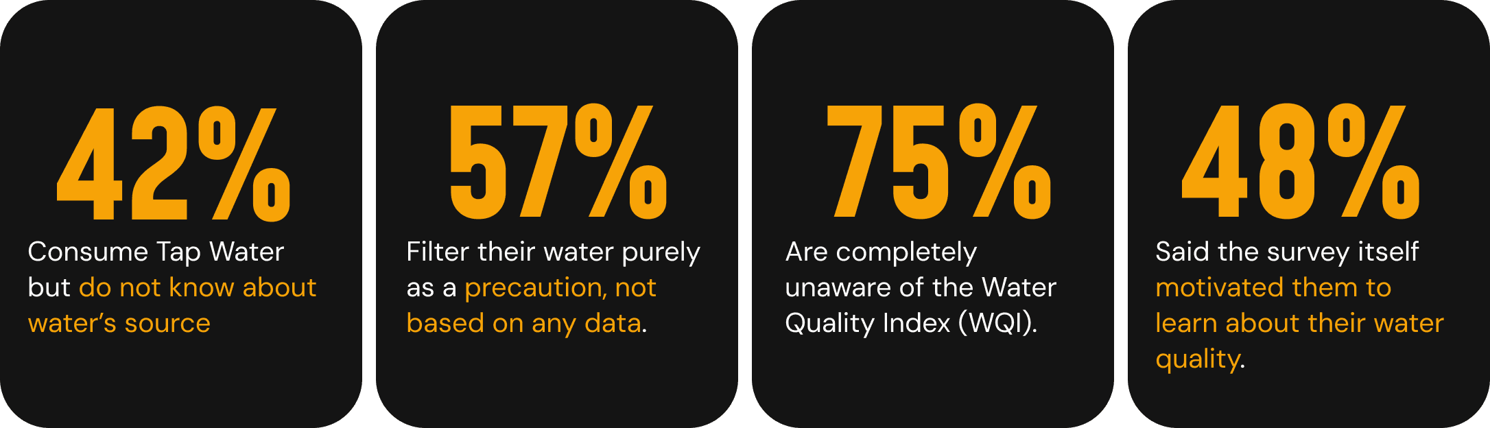
Access to water quality information is critical for informed health decisions. On university campuses, students often consume tap water without any knowledge of its quality or source.
The core challenge was one of translation:
How might we transform complex, real-time sensor data into an engaging and accessible format that encourages awareness and informed choices?
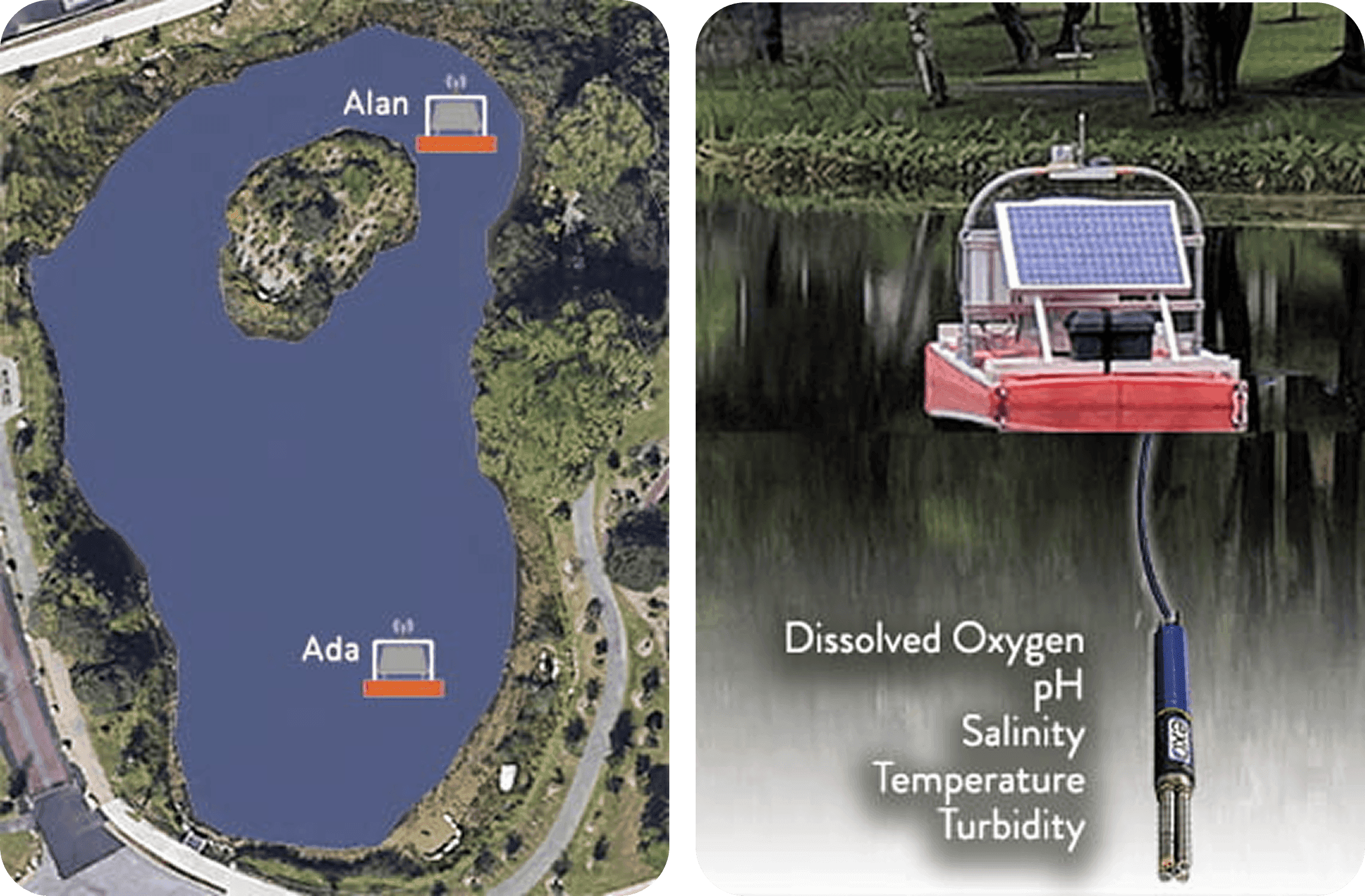
Meet ADA & Alan, monitoring stations in pond Chaotte on Pace University Pleasantville Campus
Leading the Research Initiative
To ensure a human-centered approach, I directed a generative research study to understand student habits and (un)familiarity with water quality. We collected 45 survey responses and conducted 10 in-depth user interviews.
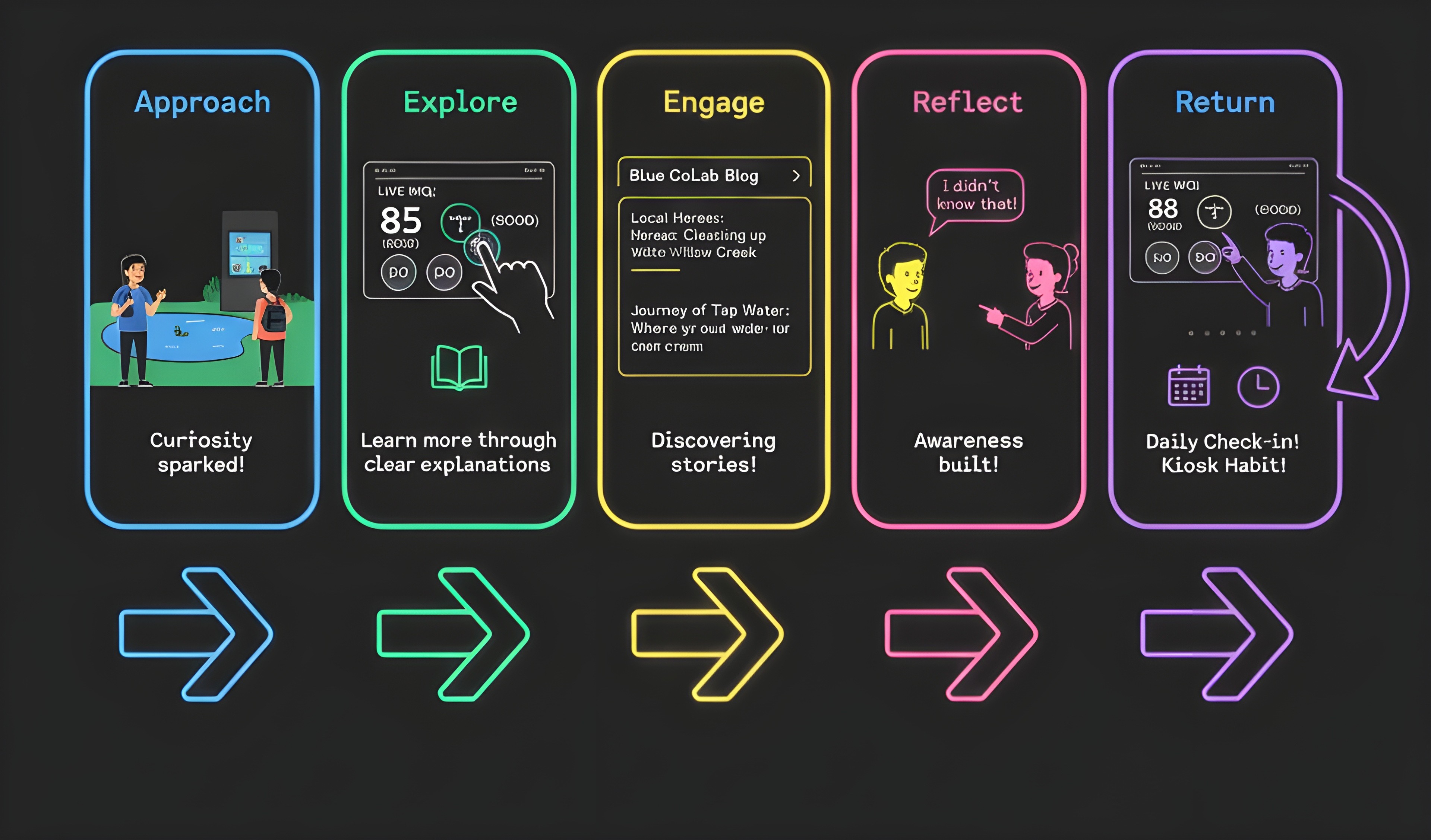
Mapping the User Journey
Understanding the student's path from ambient curiosity to active learning was key to designing an intuitive flow for the kiosk.
Synthesizing the Data
Strategic Takeaway
"Our initial assumption was that students wouldn't engage with environmental data. Research proved the opposite: awareness can be triggered through accessible, engaging design."
Key Design Decisions

Business & User Impact
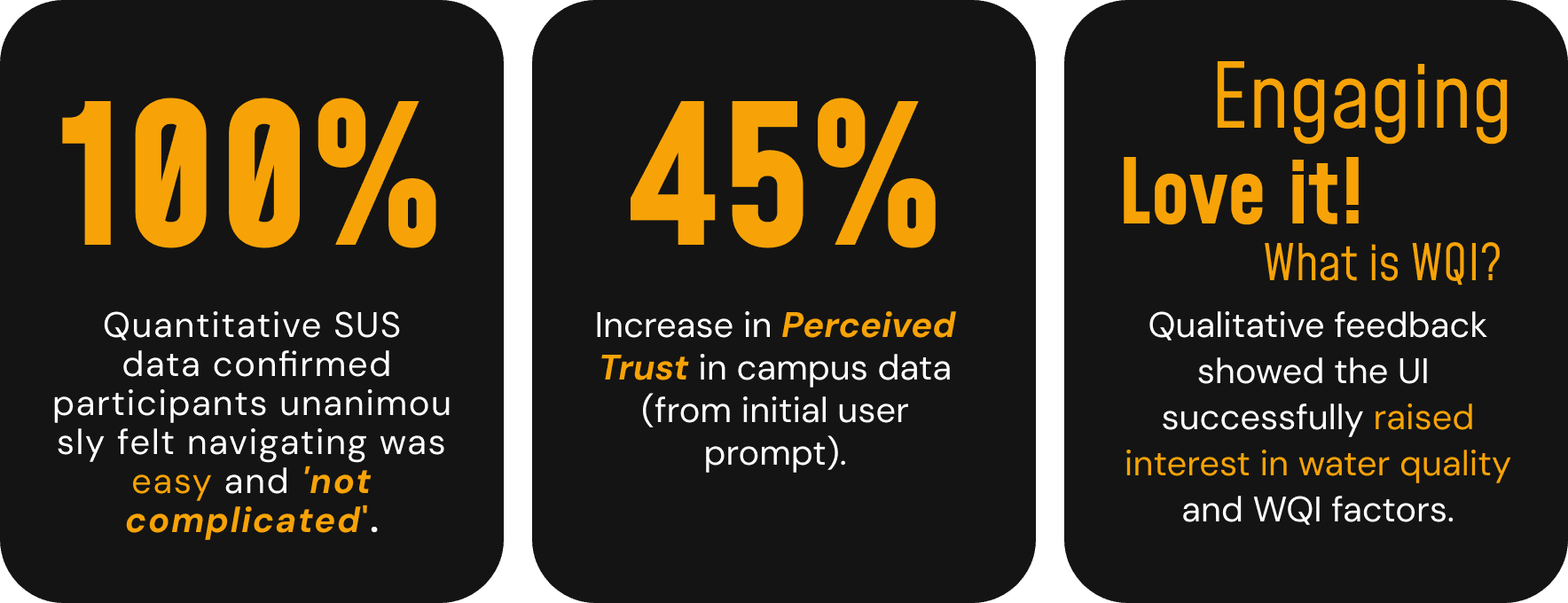
The design strategy successfully translated complex data into a tool that was quantifiably easy to use and qualitatively engaging, sparking community discussion and awareness.
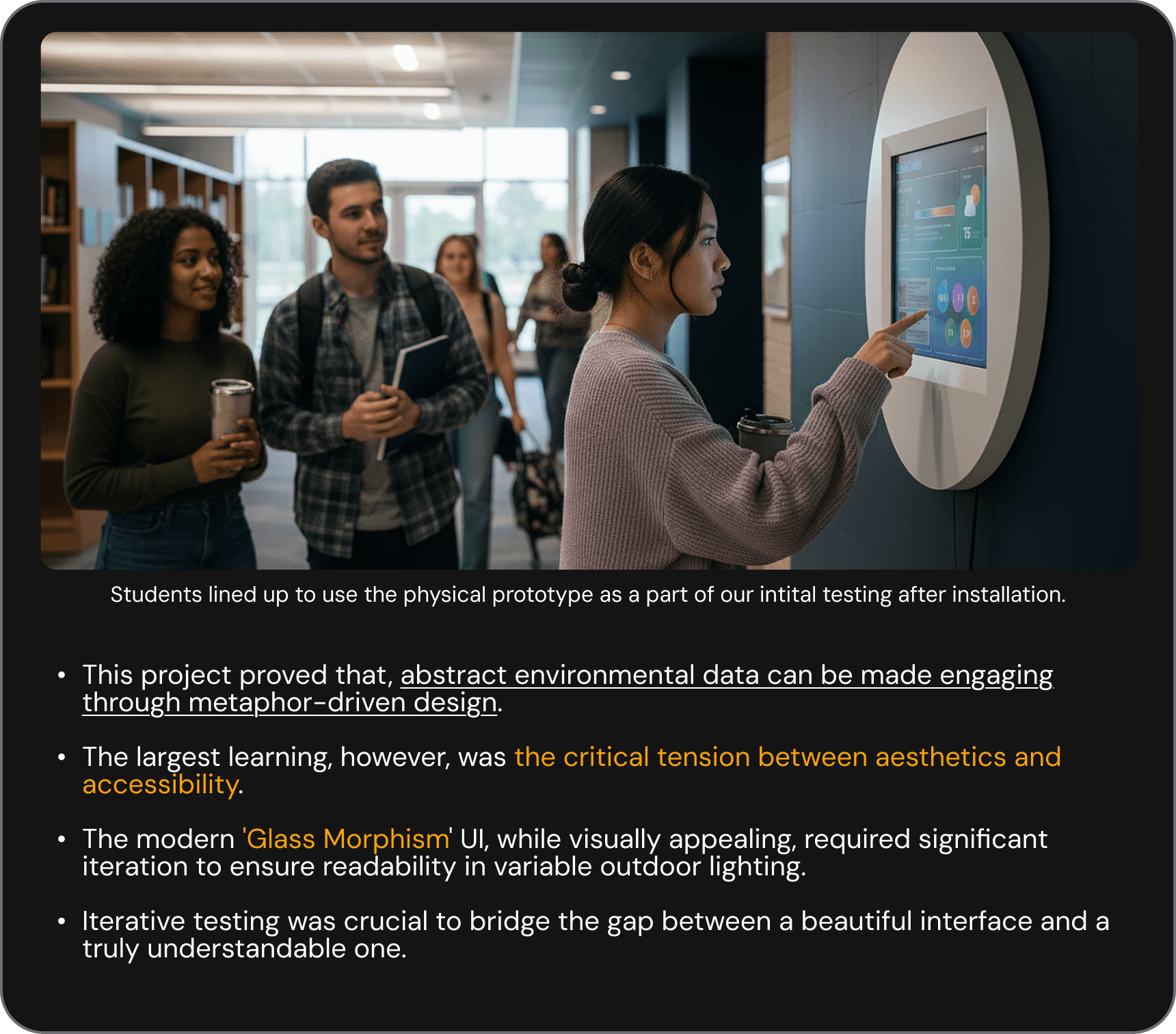
Learnings & Key Take Away: